COVIDIEN REPORTS
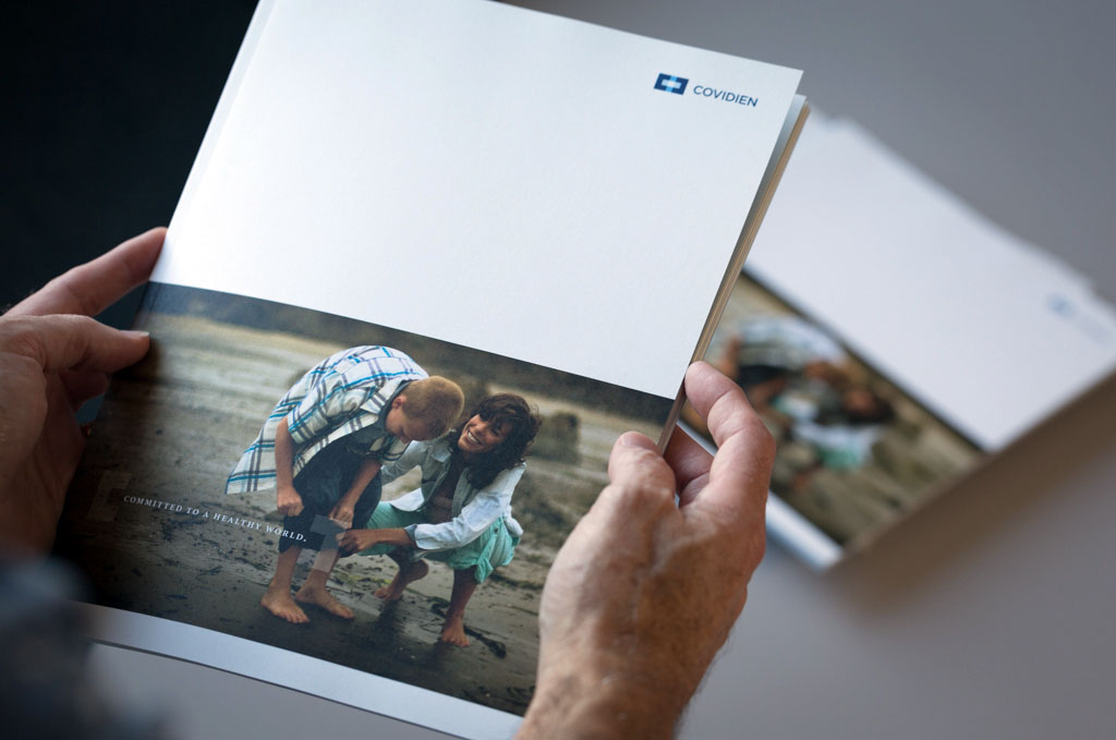
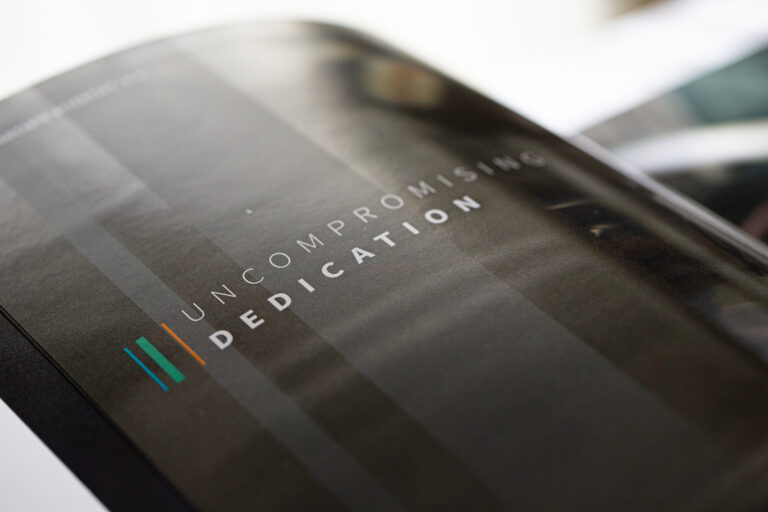
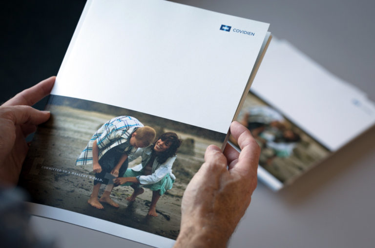
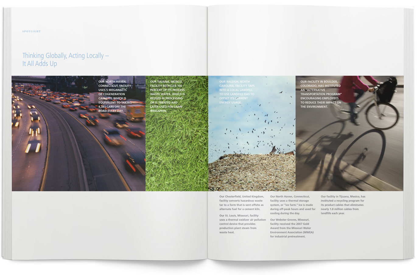
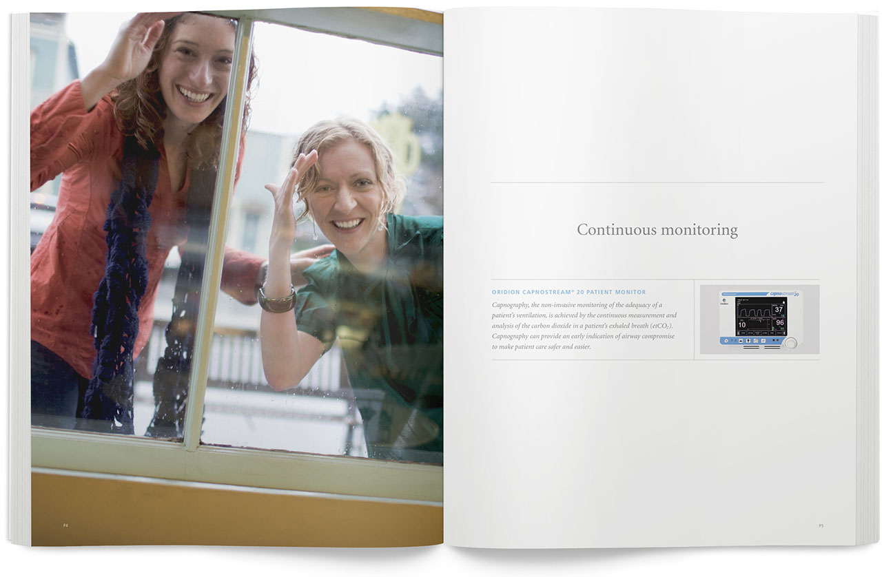
Our relationship with Covidien spanned several years, allowing us to develop a high level understanding of their brand and carry that through each report. Year to year, the reports followed a similar visual thread, and though unique, became a chapter in a much larger story.
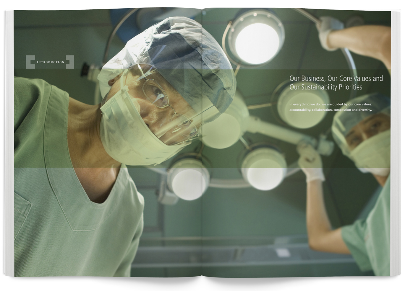
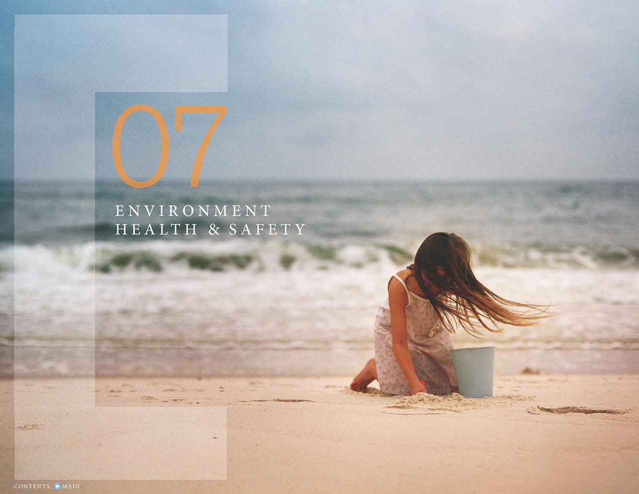
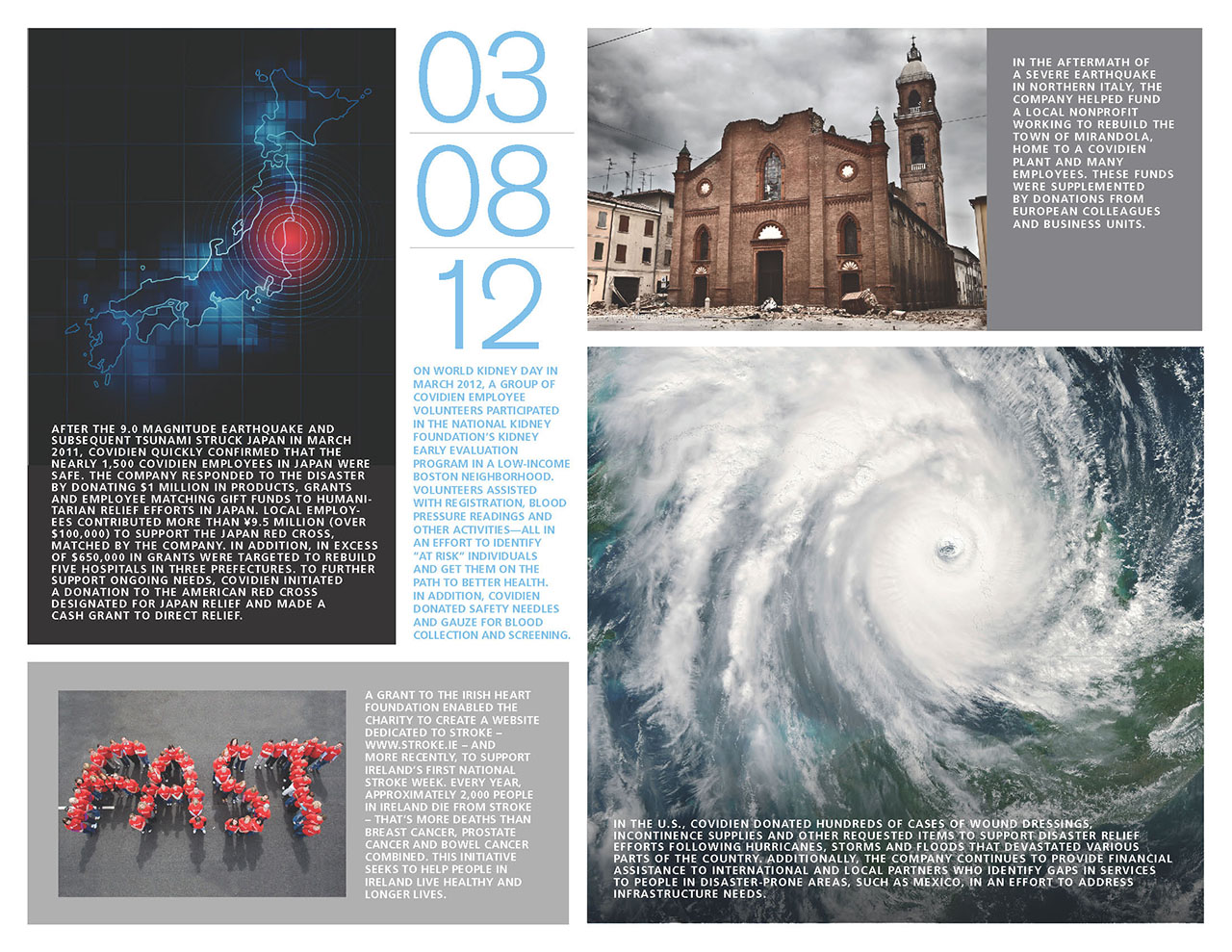
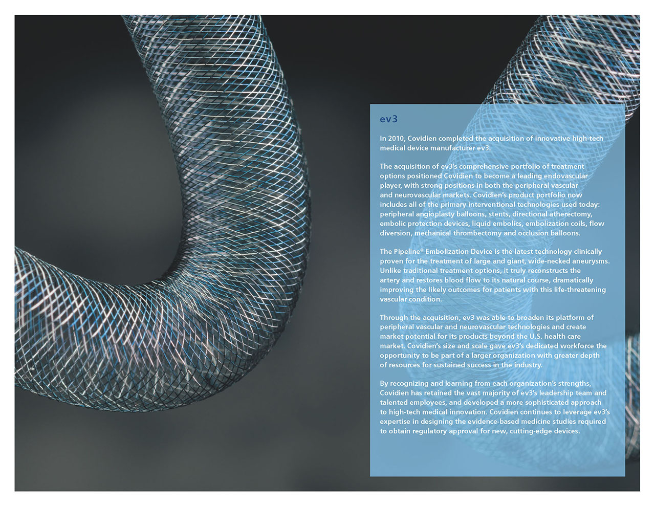
The bold use of dramatic photography, clean and clear layouts, generous use of white space, and simple typography in the companies initial sustainability report, set the visual tone for years to come.
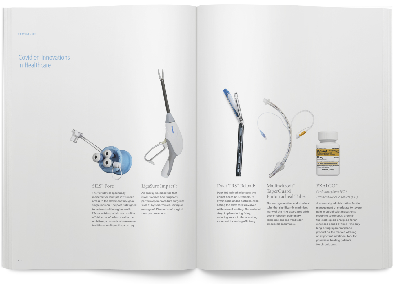

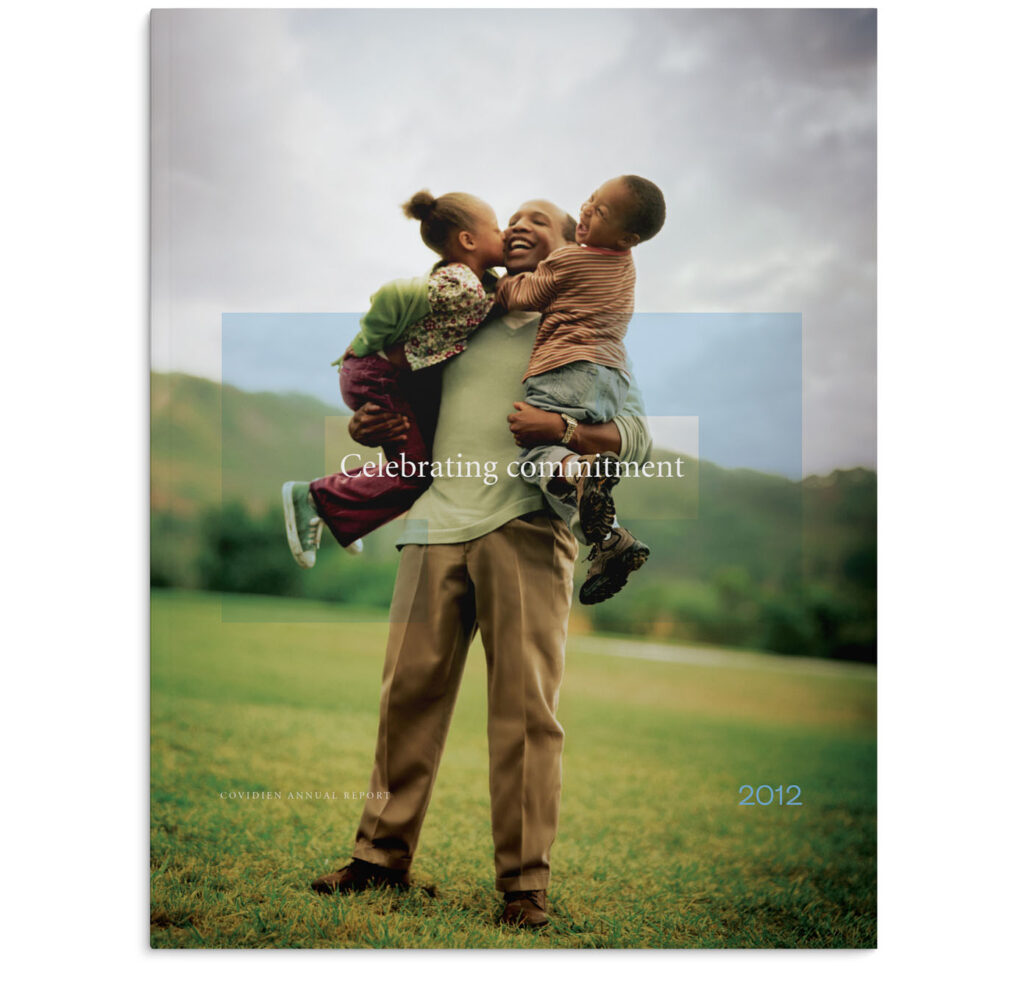
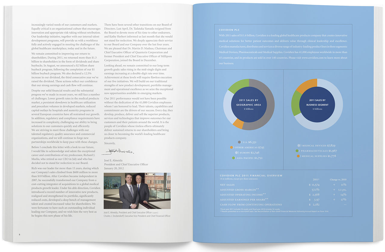
2012 Annual Report
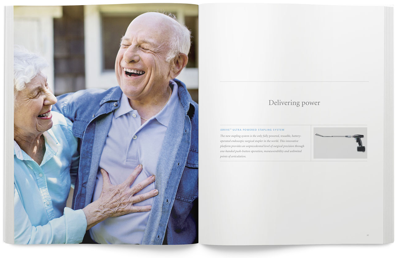

2011 Annual report

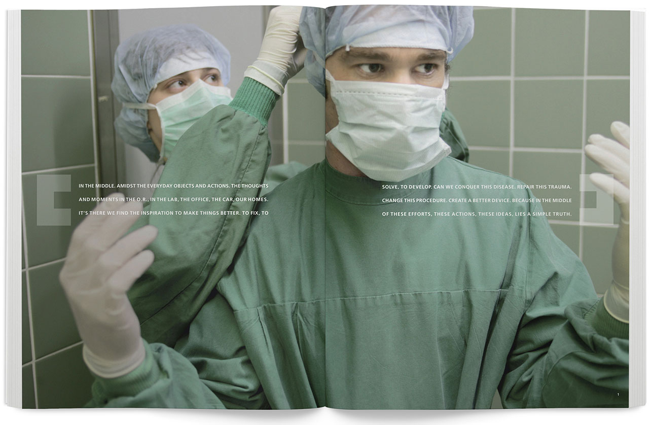
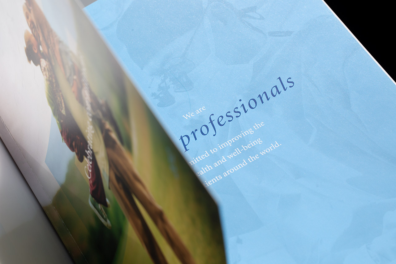
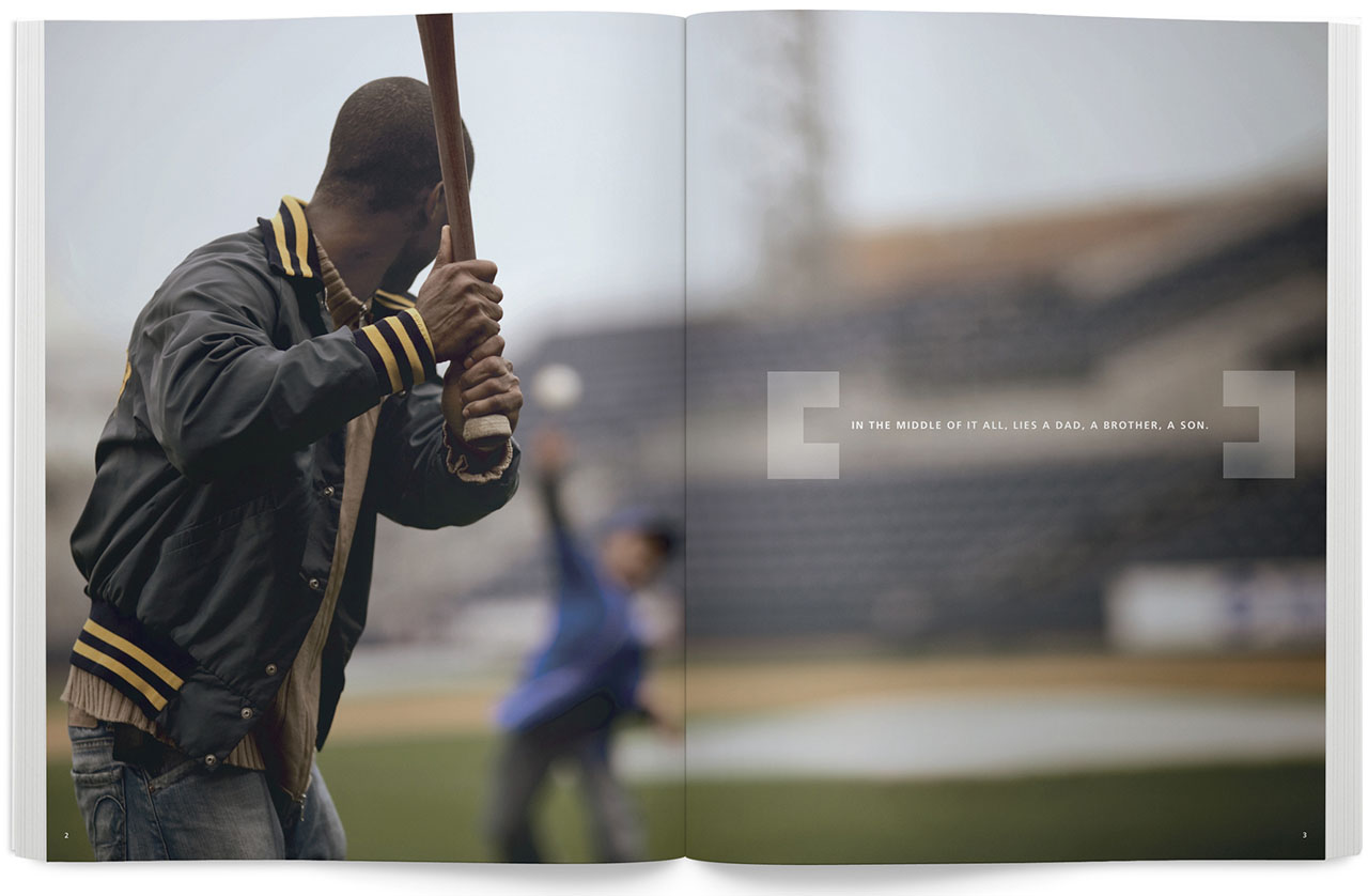
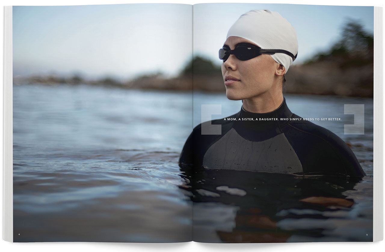
Along with the carrying through visual voice of the company, we incorporated an emotive concept that let the story unfold over a few opening spreads.
Story text: In the middle, amidst the everyday objects and actions. The thoughts and moments in the O.R., in the lab, the office, the car, our homes. It's there we find the inspiration to make things better. To fix. To solve. To develop. Can we conquer this disease. Repair this trauma. Change this procedure. Create a better device. Because in the middle of these efforts, these actions, these ideas, lies a simple truth. In the middle of it all, lies a dad, a brother, a son. A mom, a sister, a daughter, who simply needs to get better.

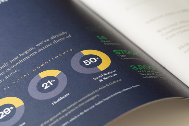
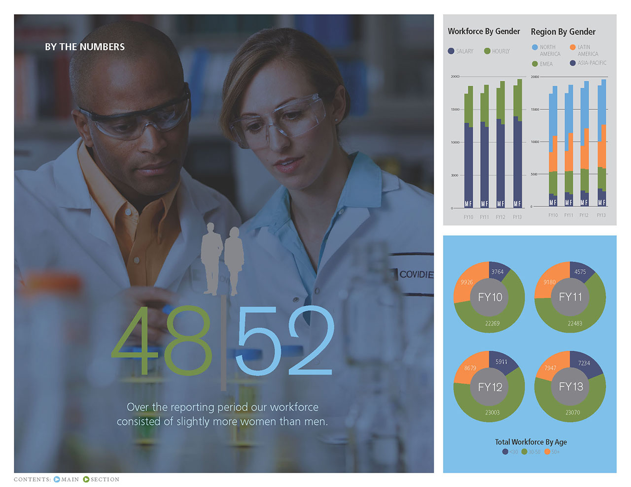
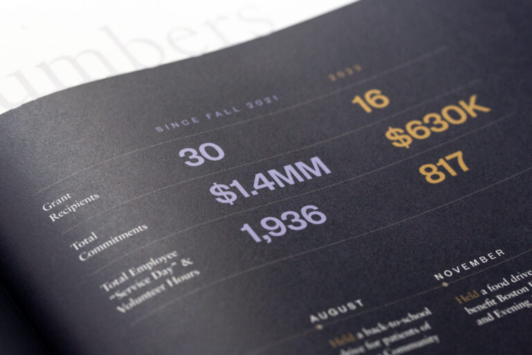
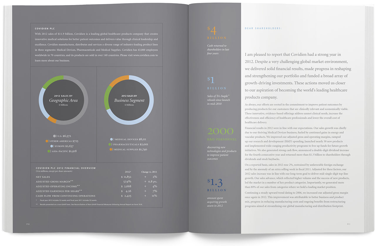
Color, layout and typography combine to make data visual
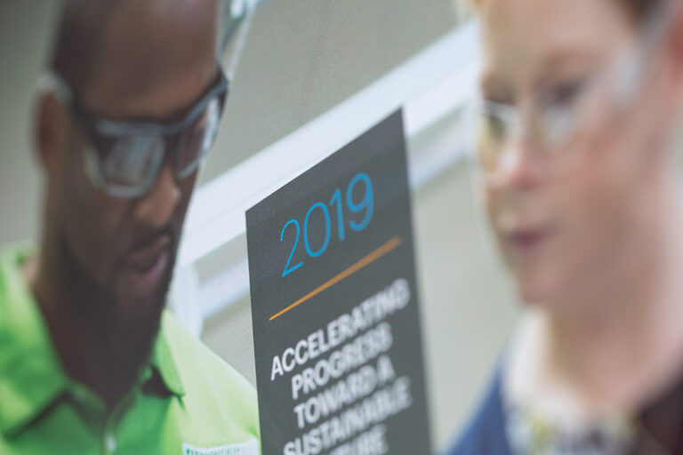
2013 sustainability report
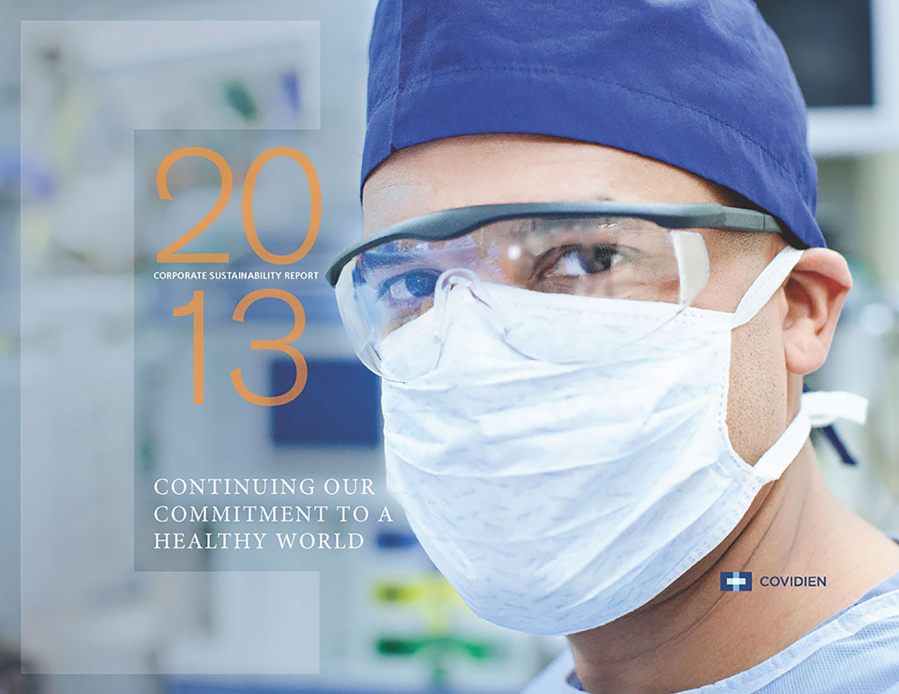
Foregoing print in the early days of the growing consciousness of sustainability, the 80 page document employed all of the design tools we had created in previous years and carried through the visual voice of the brand.
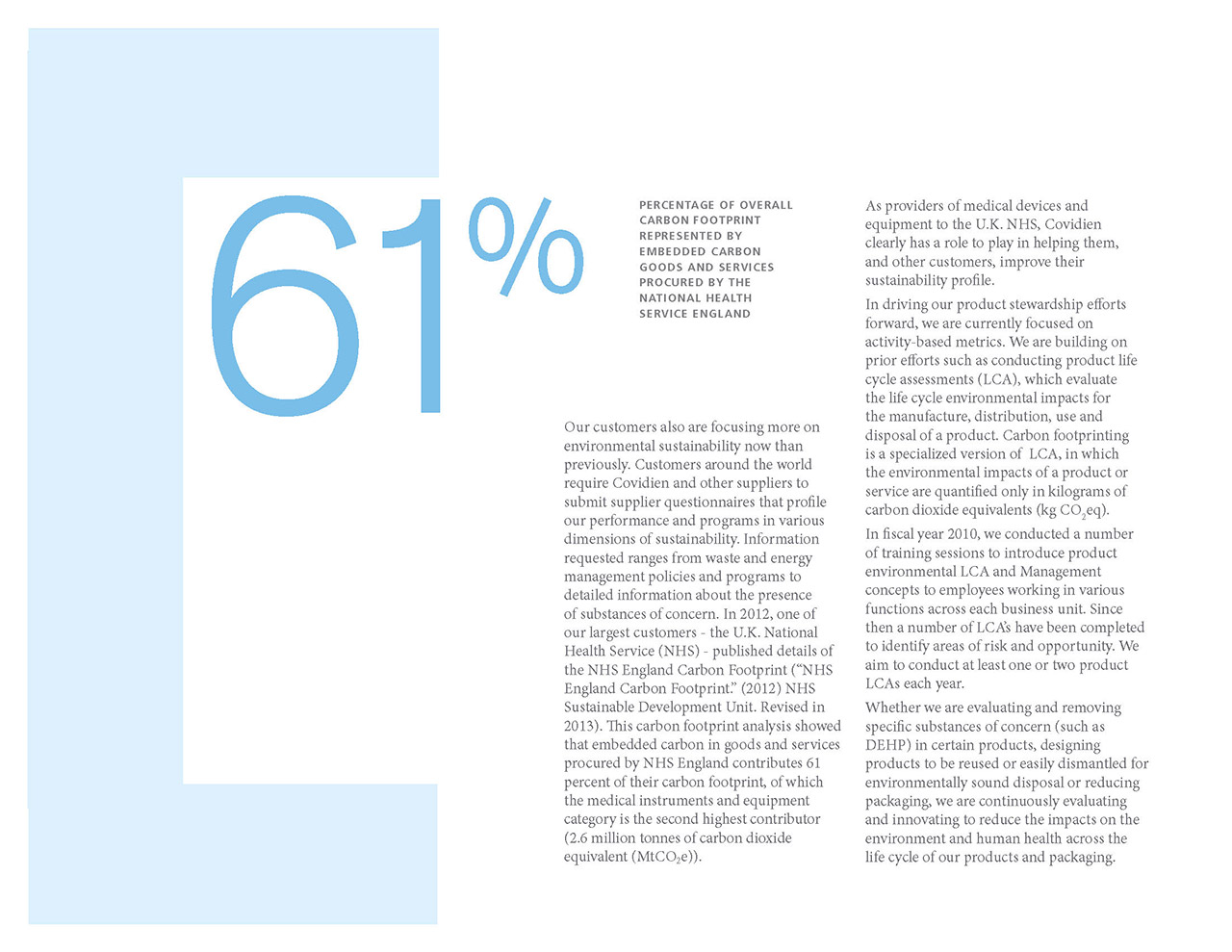
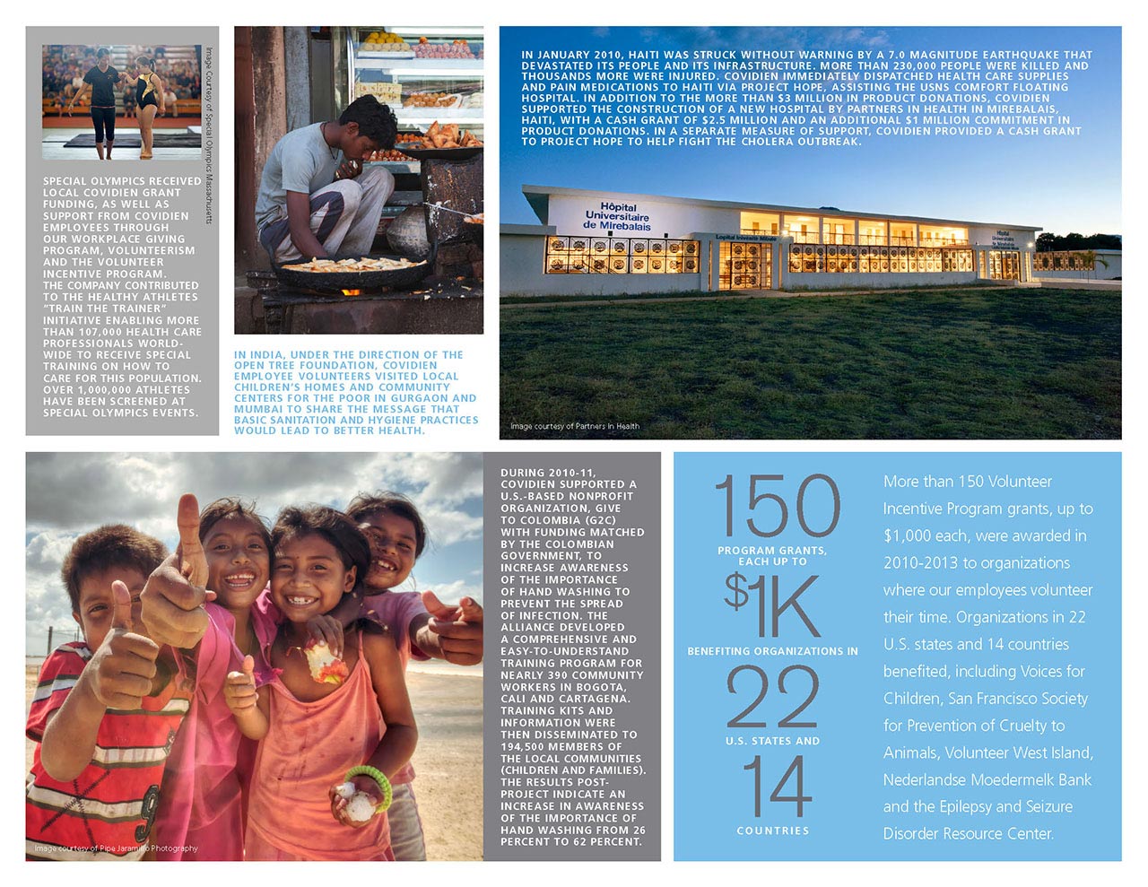
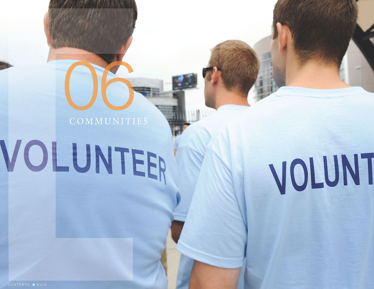
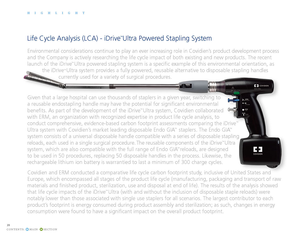
The pace and flow of the text heavy document was managed with large images, callouts, sidebars and infographics. Color and typography similar to previous years helped to keep the visual voice consistent.
