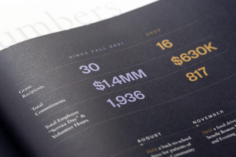
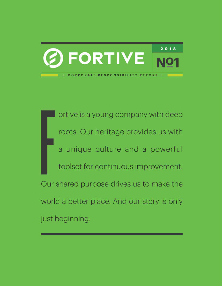
FORTIVE 2018 CSR
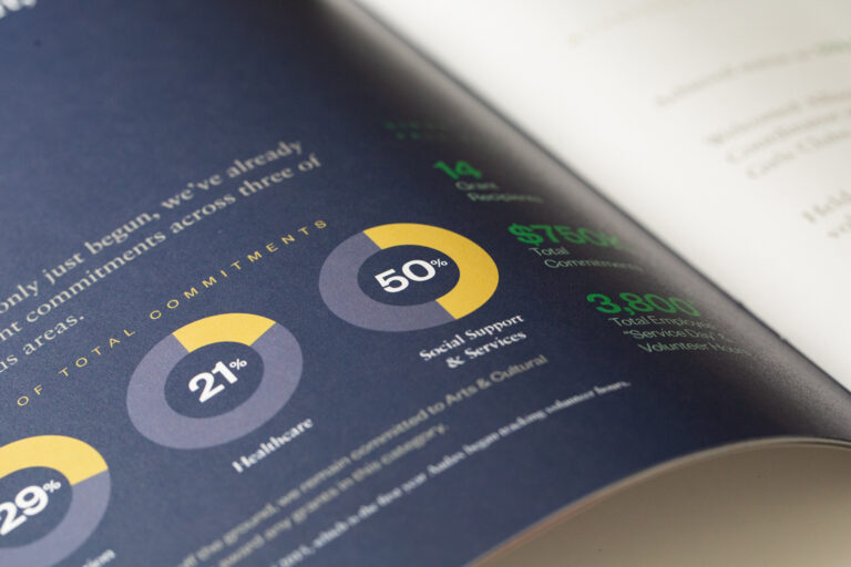
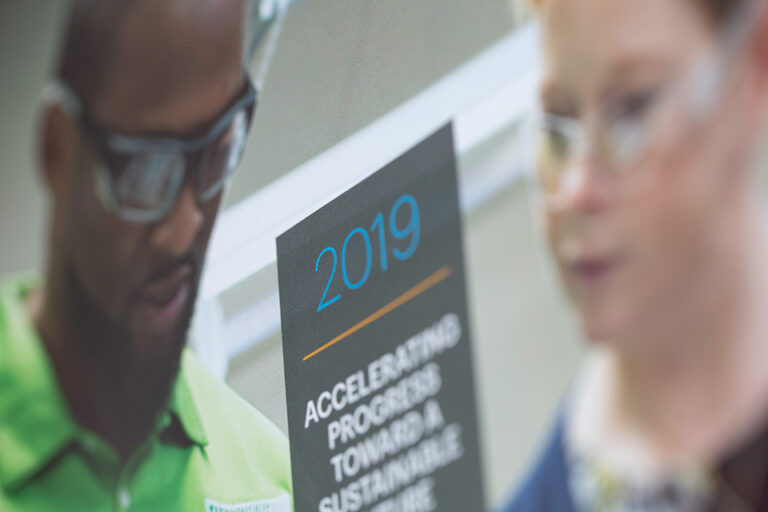
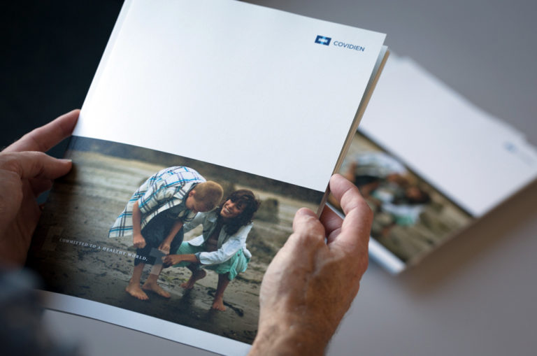
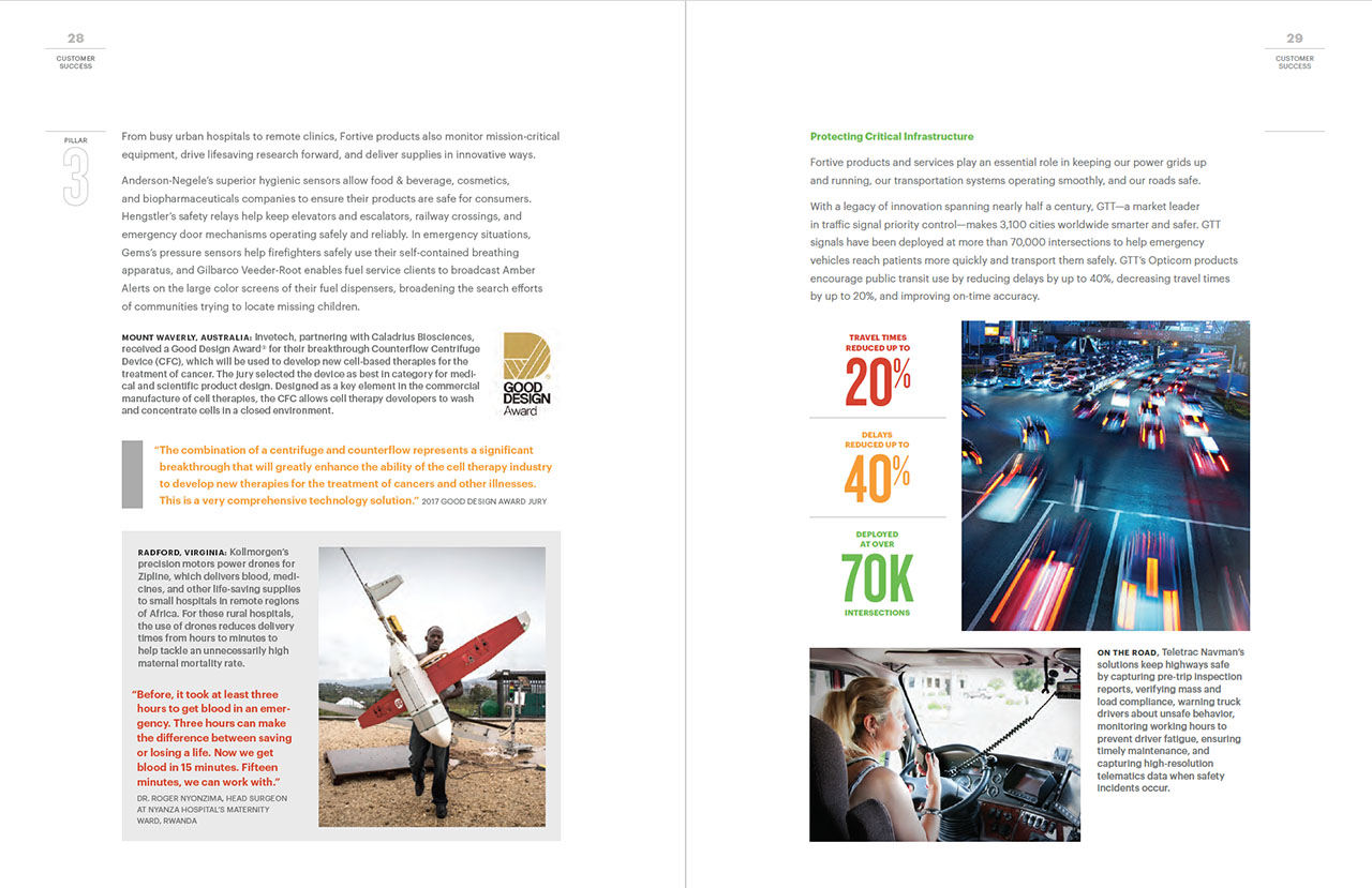
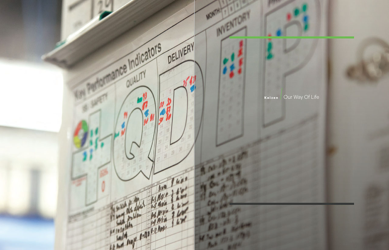
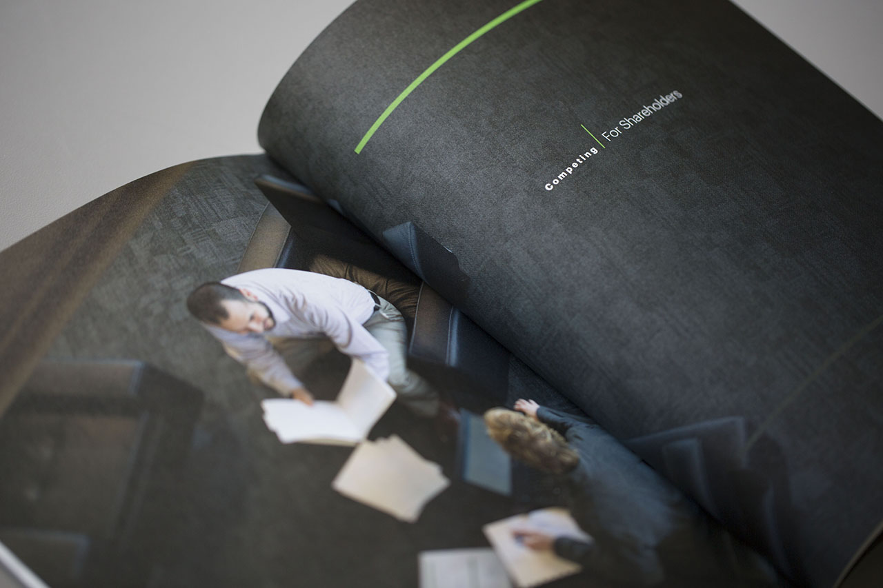
A very simple and neat design made the information the star of the show. Text heavy pages, broken up with small images and captions, were separated by simple, photographic divider pages, which added visual texture to the report. The vibrant corporate color palette added lively highlights throughout.
CSR landing page
We designed a static landing page to echo the look of the printed report and to house the downloadable PDF of the report. Simplicity and a few top-line metrics created interest, and encouraged readers to download the full report.


