INSMED 2019 ANNUAL REPORT
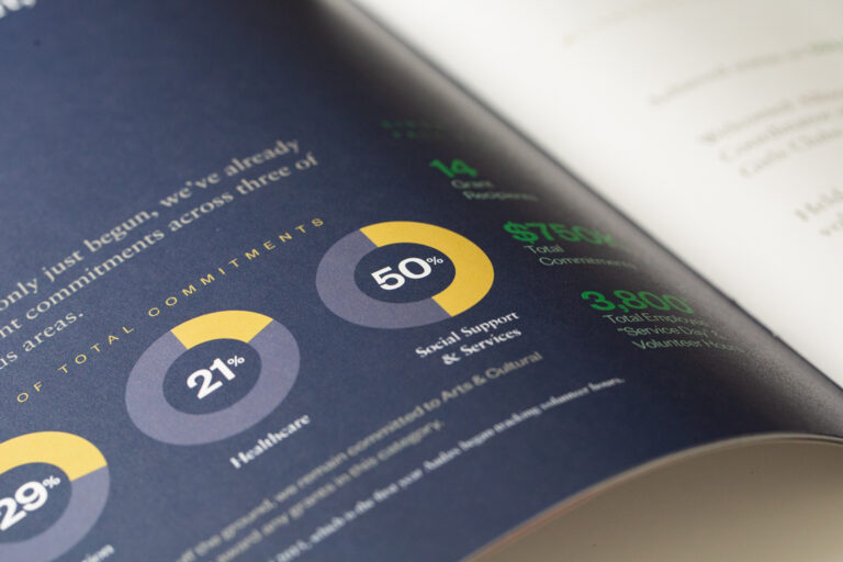
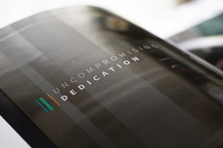
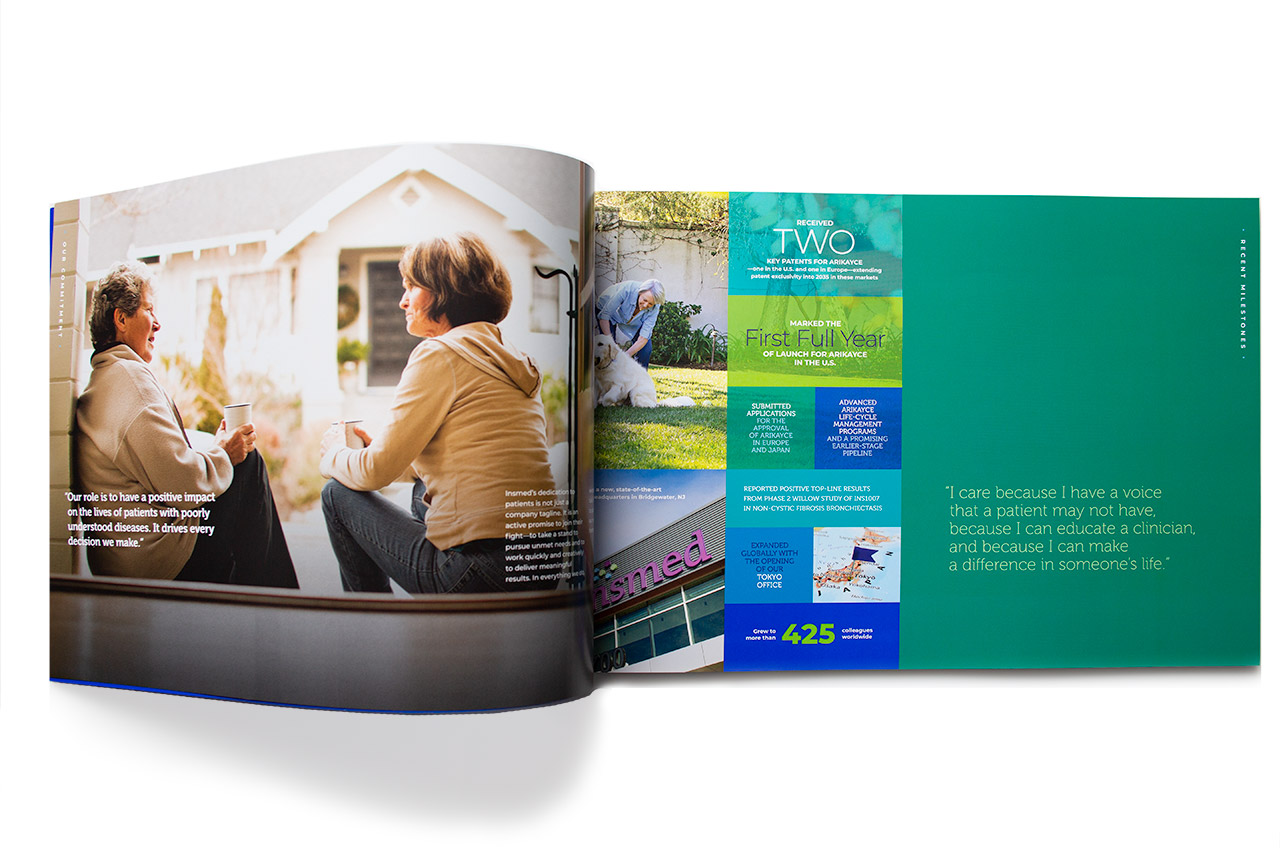
An unusual size, large typography, and a bright color palette combined to create a unique visual statement, and echoed the vibrancy of the company’s spirit.
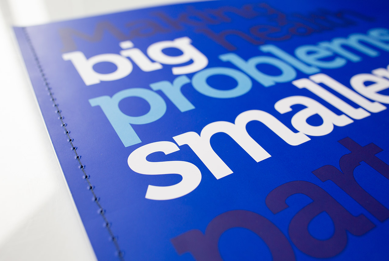
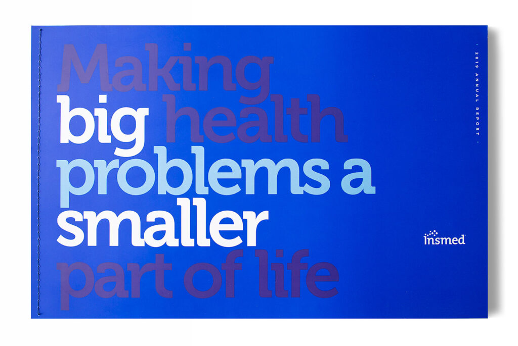
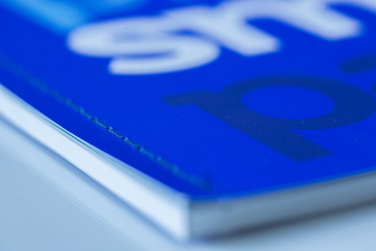
The oversize 17×11 format and the sewn binding, gave the printed version a unique feel and set it apart from other reports and brands. The size also accommodated existing 10-k typesetting specifications and required no additional typesetting costs.
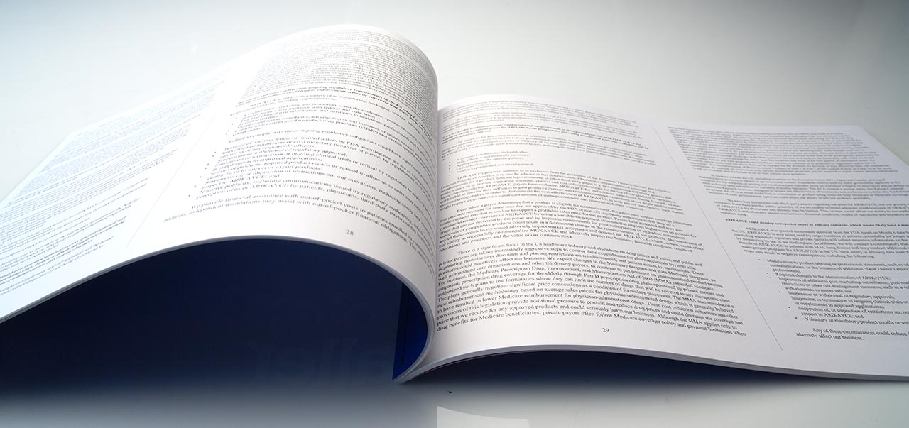
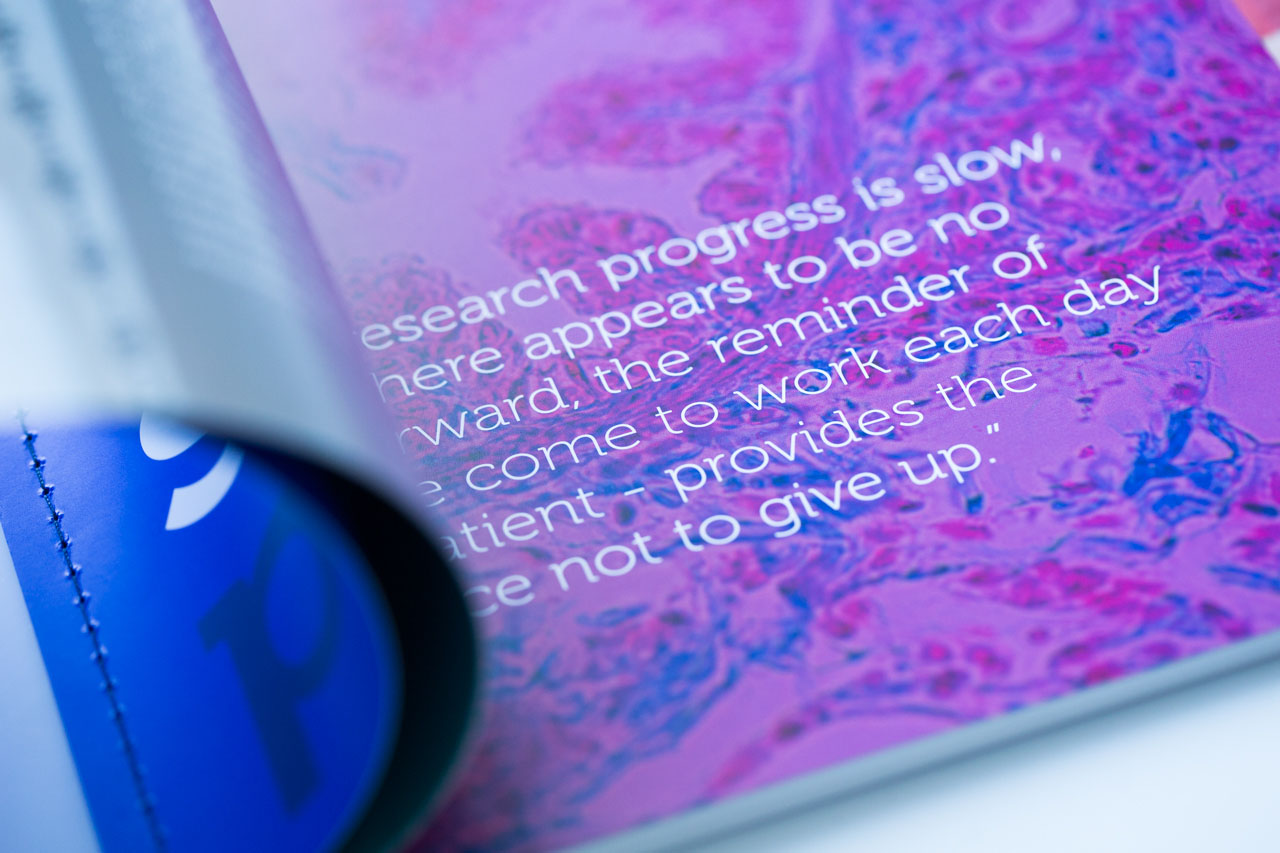
Large typography made the report easy to read but also enhanced the visual statement and the energy of taking on a big challenge.
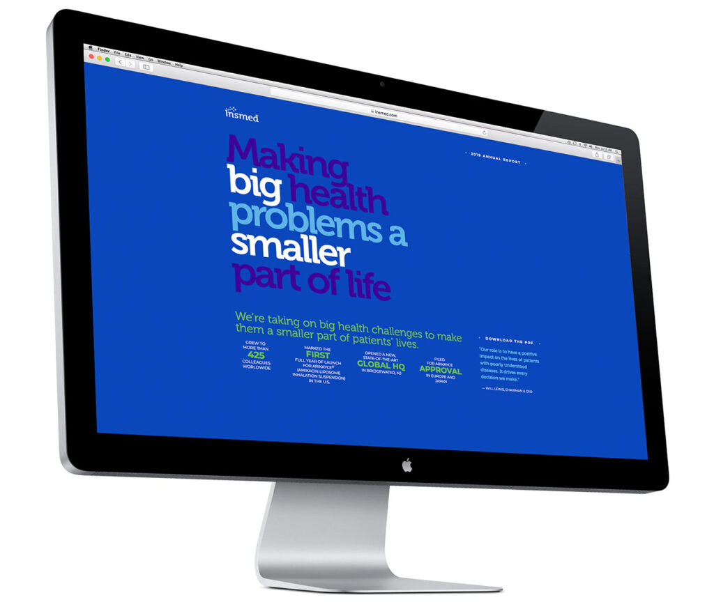
A very simple landing page offered a few top line points while directing readers to the full downloadable pdf.

