Based on a solid foundation in the business as Lee Munder Capital Group, LMCG Investments and LMCG Funds needed a new logo, a new website, and a new look that would separate the companies, but still carry the overall brand forward.
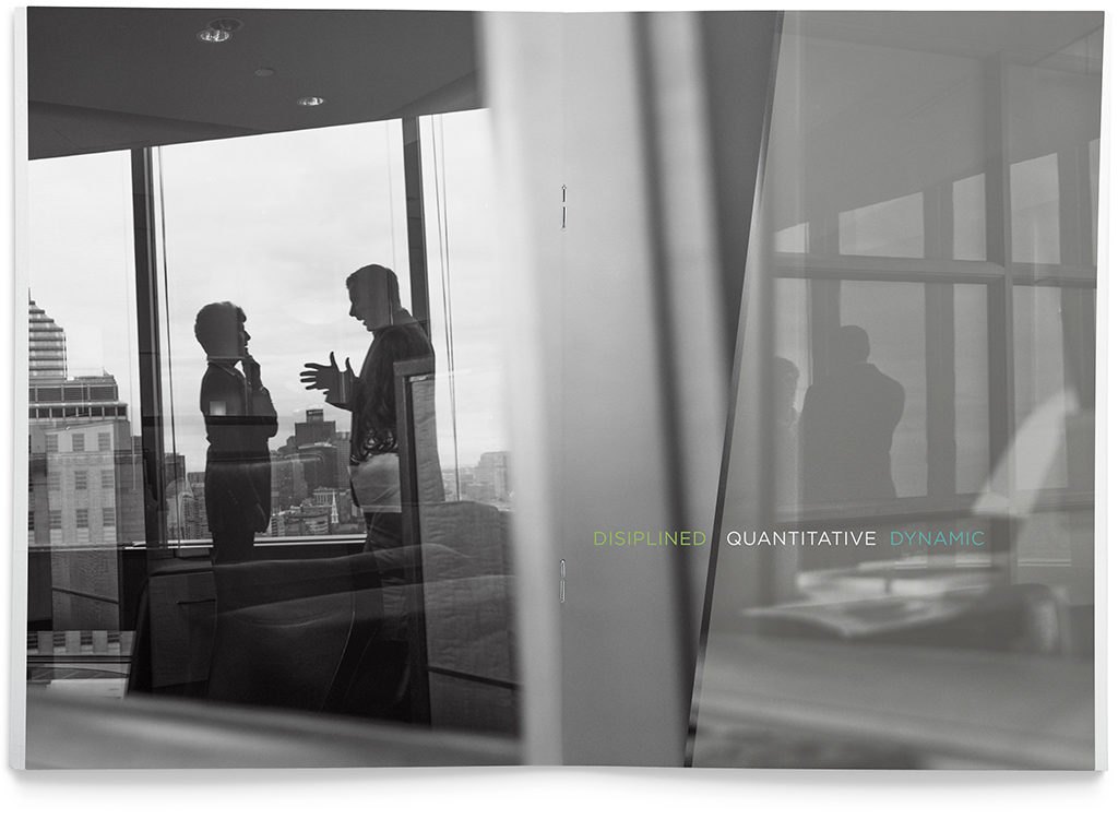
black and white photography offered uniqueness in the space and an artful presence for the brand.
the new brand
Representing teams of specialists working within a solid foundation, the new logo was designed to work with different color combinations and in different formats.
The funds group used an entirely different color palette lending it a unique feel, while maintaining a solid connection to the parent brand.
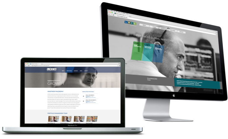
corporate and divisional websites
The corporate website was created with a relatively quiet, reserved look to give the parent company an established and sophisticated feel, while the multi faceted funds group extended the look with a more colorful and active approach.
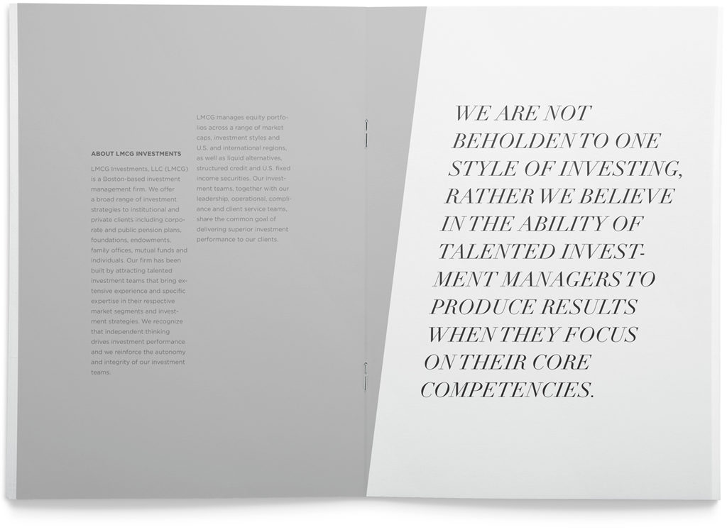
Print collateral
print collateral used strong angles, color and typography to help make the information dynamic