CIVICA Rx
A clean, crisp, “pharmaceutical white” look, utilizing open space for simple, direct statements, complemented the company’s bold mission to combat generic drug shortages in hospitals.

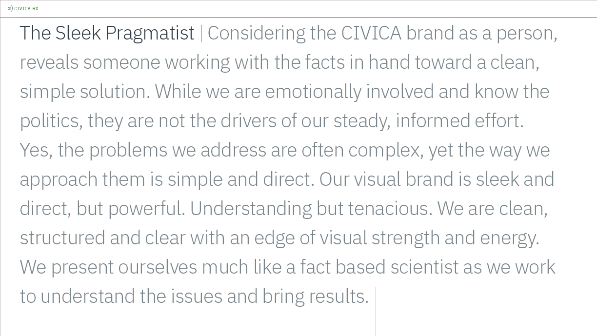
Our branding work included an expanded color palette, a typography palette, a Powerpoint template, and general design guidelines, along with a personality statement to help define the brand.

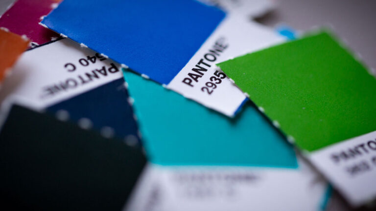
We increased the practicality and impact of the existing green color palette by adding a few neutral tones and some vibrant, “disruptive” colors to help highlight and emphasize salient information.

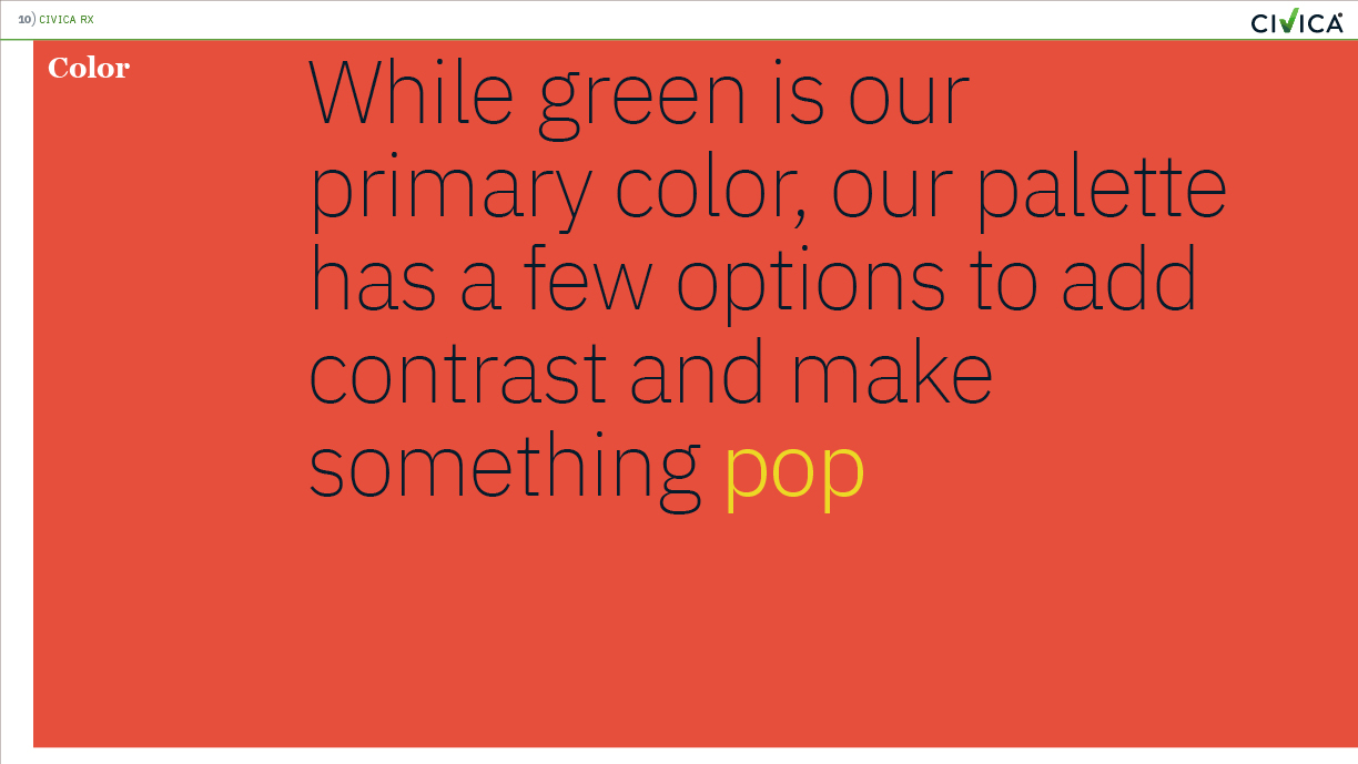
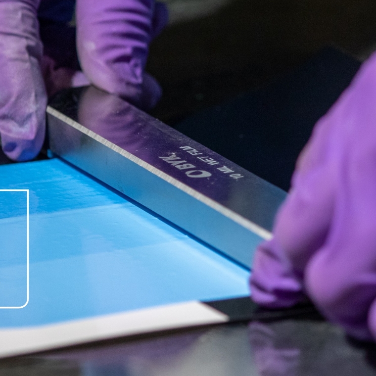
The mix of color, large and small typography, clean layout, and distinct emotive photography aligned with their philosophy of straight forward, clear thinking.
